Data Visualization Best Practices for Clearer Insights
March 4, 2026 | By GenRPT
Introduction
In today’s fast-paced digital world, making sense of vast amounts of data is more critical than ever. Companies rely heavily on data collection and analysis to guide strategic decisions, improve operations, and understand customer behavior. However, raw data alone can be overwhelming and difficult to interpret. This is where data visualization comes into play. By transforming complex datasets into visual formats, organizations can unearth insights more effectively and communicate findings clearly. As a key component of effective business intelligence, data visualization techniques help turn data analysis into meaningful stories that influence action. Utilizing the best practices in this field ensures that insights are not only accurate but also accessible to decision makers at all levels.
About the Topic
Data visualization involves representing data graphically to highlight patterns, trends, and outliers that might be less apparent in raw datasets. This process supports various functions such as forecasting, identifying correlations, and monitoring key performance indicators. As technology advances, AI software has become an integral part of data visualization, enabling automated and dynamic charting, pattern recognition, and predictive analytics.
Incorporating data visualization into business intelligence strategies enhances clarity and fosters better collaboration across teams. When executed well, visualizations can provide a quick overview of critical metrics, making it easier to identify areas needing attention. These practices are especially vital in data analysis, where complexity and volume can obscure understanding if not displayed appropriately.
Data visualization is not just about pretty charts; it is a strategic tool that should be aligned with analysis goals. Effective visualization techniques remove unnecessary clutter, focus on relevant data points, and utilize visual cues such as color and size to convey meaning efficiently. Successful application of these principles leads to quicker insights, smarter decisions, and a competitive advantage in various industries.
Title-Specific Strategic Section
Foundations of Effective Data Visualization
To maximize the benefits of data visualization, organizations need to follow specific best practices that enhance clarity and communicative power. First, understanding your audience is crucial. Technical teams might appreciate detailed dashboards, while executive stakeholders prefer high-level summaries. Tailoring visualizations to meet different needs ensures impactful communication.
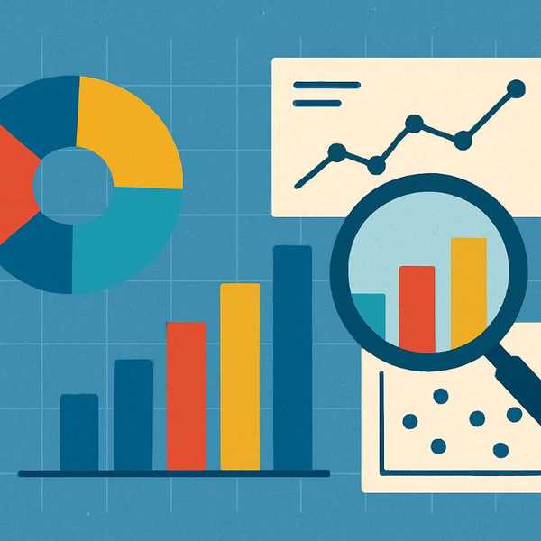
Next, choose the right type of visualization for the message you want to convey. Common types include bar charts for comparison, line graphs for trends over time, pie charts for proportions, and heat maps for density analyses. Overusing complex visualizations or employing inappropriate chart types can lead to confusion rather than clarification.
Clarity is paramount. Use simple, clean designs that avoid extraneous elements. Consistent color schemes and labeling help prevent misinterpretation. For example, using distinct colors for different categories and providing clear axis labels support comprehension. Data visualization tools powered by AI software can assist in automatically suggesting the most appropriate visual formats based on data characteristics.
Another key principle is the judicious use of data aggregation. Presenting summarized data reduces clutter and highlights the most significant insights. However, it is essential to balance detail and simplicity; drill-down capabilities allow users to explore deeper layers if needed. Incorporating interactivity and filters enhances user engagement and enables personalized data exploration.
Finally, regular validation of visualizations is important. Ensure data accuracy and verify that visual formats accurately reflect underlying datasets. Continuous feedback from users can identify areas for improvement, making visualization efforts more effective over time.
Use Cases
Data visualization finds application across numerous business functions. In marketing, visual dashboards display campaign performance metrics, customer engagement levels, and market segmentation. Sales teams use visual reports to track revenue trends, regional performance, and product popularity, helping to identify growth opportunities.
In operations, visual tools monitor supply chain logistics, inventory levels, and production efficiency. This enables managers to respond swiftly to disruptions and optimize processes. Financial analysts rely on visualizations to perform trend analysis, risk assessment, and scenario planning, making complex financial data accessible and actionable.
Customer support centers utilize dashboards to track ticket resolution times, customer satisfaction scores, and common issues. Such insights guide service improvements and resource allocation. Human resources departments leverage data visualization to analyze workforce metrics, including staffing levels, turnover rates, and employee engagement.
Technological advancements have also enabled the integration of data visualization with AI software. These tools can automatically generate visual reports, detect anomalies, and forecast future trends. These capabilities empower organizations to stay proactive and make data-driven decisions swiftly.
Future Outlook
The future of data visualization is poised for significant growth driven by ongoing technological innovations. As AI software continues to evolve, visualization tools will become more intelligent, capable of suggesting optimal visual formats and highlighting critical insights in real-time. This integration will streamline the analytical process, allowing users to focus on interpretation rather than construction.
Augmented reality (AR) and virtual reality (VR) are also emerging as innovative mediums for data visualization. These immersive technologies have the potential to provide three-dimensional representations of complex datasets, enhancing understanding in fields such as engineering, healthcare, and manufacturing.
Additionally, the rise of automated data analysis platforms will make data visualization more accessible to non-technical users. Interactive dashboards with self-service features will enable broader organizational adoption of business intelligence practices. As privacy and data security concerns grow, future solutions will incorporate stronger safeguards without compromising usability or insight quality.
The continuous improvement of visualization AI software enhances the ability to process unstructured data, like social media streams or customer feedback, transforming unorganized information into meaningful visual narratives. These advancements will facilitate a deeper understanding of customer behaviors, market shifts, and operational bottlenecks.
Conclusion
Effective data visualization practices are fundamental to turning raw data into actionable insights. By adhering to principles such as clarity, appropriate chart selection, audience focusing, and continuous validation, organizations can significantly improve their business intelligence efforts. The integration of AI software further elevates these capabilities by enabling automated insights and predictive analytics, making visualizations more dynamic and responsive.
Using best practices in data visualization helps uncover hidden patterns, facilitates faster decision-making, and promotes greater collaboration within teams. It empowers businesses to stay ahead in competitive landscapes and adapt quickly to changing conditions.
GenRPT supports the pillar title by providing advanced tools that enhance data analysis and visualization processes. Its capabilities allow users to create clear, impactful visual representations of complex data, ensuring that insights are not only accurate but also easily understood. Embracing these best practices with the aid of modern tools like GenRPT leads to smarter strategies and more informed decisions—vital components of success in today’s data-driven world.