Avoiding Common Mistakes in Data Visuals
March 4, 2026 | By GenRPT
In the realm of data analysis, effective data visualization is crucial for making informed business decisions. When presenting complex information, clear and accurate visuals help stakeholders understand patterns, trends, and outliers quickly. However, many organizations encounter pitfalls that compromise the utility of their data visuals, leading to misinterpretations and missed opportunities. Recognizing and avoiding these common mistakes can significantly enhance the quality of insights drawn from data analysis efforts. This article explores these pitfalls, offers strategic guidance, and highlights how tools like GenRPT can assist in creating compelling, accurate visuals.
Understanding the Importance of Clear Data Visuals
Data visualization transforms raw data into visual formats such as charts, graphs, and dashboards, making information easier to grasp. In an environment where AI software and business intelligence tools are increasingly integrated into daily workflows, the ability to craft effective visuals is more vital than ever. When executed properly, these visuals support clearer communication, identify critical issues, and reveal opportunities that might be hidden in raw data. Conversely, poor visualizations can lead to misunderstandings, flawed decisions, and lost competitive advantages.
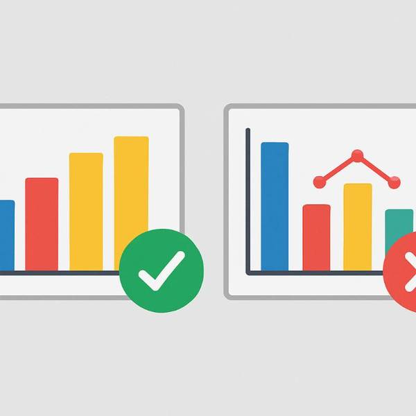
Common Mistakes in Data Visuals and How to Avoid Them
Overloading visuals with information — A frequent mistake is cluttering visuals with excessive data points or annotations. This can overwhelm the viewer, making it difficult to interpret the main message. To prevent this, focus on essential data and use filtering options or interactivity to reveal additional details as needed.
Using inappropriate chart types — Not all visuals suit every type of data. For instance, using a pie chart to display multiple categories with subtle differences can be misleading. Selecting the right visualization, such as bar charts for comparisons or line graphs for trends, ensures clarity and accuracy.
Neglecting to consider audience perspective — Graphs and dashboards should cater to the audience’s level of expertise and interest. Technical visuals may confuse non-technical stakeholders, while overly simplified visuals might omit critical details for analysts. Striking a balance and tailoring visuals accordingly enhances their effectiveness.
Ignoring context and scale — Visuals must accurately reflect the scale and context of the data. Distorted axes, truncated ranges, or manipulated scales can misrepresent information. Always verify that axes are correctly labeled and scaled to provide truthful insights.
Inconsistent color schemes and labeling — Use of inconsistent or non-intuitive color schemes hampers understanding. Clear labels, legends, and color choices that align with standard conventions improve readability. For instance, using red for negative trends and green for positive ones is widely recognized.
Lack of interactivity and customization — Static visuals limit exploration, especially in complex datasets. Interactive dashboards enable users to drill down, filter, and explore data dynamically, fostering deeper understanding.
The Role of Business Intelligence and Data Analysis in Avoiding Mistakes
Business intelligence platforms leverage data analysis techniques and AI software to automate and optimize visualization processes. These tools often include features for detecting anomalies, suggesting appropriate chart types, and ensuring data consistency. Properly used, they reduce the likelihood of common mistakes and improve the overall quality of insights.
Data visualization is at the heart of effective data analysis. When done correctly, it supports strategic decision-making by clearly communicating key metrics. Conversely, errors in visual representation can mislead decision-makers, leading to costly mistakes. That is why integrating robust practices and technology is essential.
Use Cases Demonstrating Good and Bad Visualization Practices
A retail company analyzing sales performance might use a well-constructed dashboard with interactive filters, enabling managers to identify regional trends easily. The visual employs appropriate charts, consistent color schemes, and clear labels, enabling quick comprehension and informed decision-making.
In contrast, an inefficient visualization might present sales data as an overly complex pie chart with numerous small slices, confusing viewers and obscuring significant trends. Such visuals can hinder understanding and misguide strategic actions.
Another example involves a financial firm presenting risk assessment data. Using a combination of accurately scaled bar and line charts allows stakeholders to compare and interpret different risk factors effectively. Conversely, a misleading graph with truncated axes may exaggerate differences and influence unwarranted decisions.
Future Outlook for Data Visualization and Business Intelligence
As data analysis continues to evolve, the importance of accurate and insightful data visualization remains paramount. Advances in AI software and machine learning enable the creation of smarter, more adaptive visuals that can anticipate user needs and present data more interactively. These innovations will address many current pitfalls by providing automated best practices and real-time validation checks.
Moreover, the integration of augmented reality and virtual visualization tools promises a new dimension in data exploration, making complex datasets more tangible. The continued development of sophisticated business intelligence platforms will facilitate better collaboration and storytelling around data, empowering organizations to make faster, more confident decisions.
Conclusion
Effective data visualization is essential for extracting value from data analysis and supporting strategic business decisions. Common mistakes such as overload, inappropriate chart types, and poor labeling can significantly diminish the utility of visuals. Being aware of these pitfalls and employing best practices, supported by advanced tools, is critical to success.
GenRPT plays a vital role in this process by providing reliable, easy-to-use reporting and visualization capabilities that help avoid these common errors. Its features enable organizations to produce clear, accurate, and compelling visuals tailored to diverse audiences. By leveraging such tools, businesses can enhance the accuracy of their insights and make better-informed decisions, ultimately driving growth and competitive advantage.
In today’s fast-paced data-driven environment, avoiding these visualization mistakes is not optional but essential. Properly designed and executed data visuals can unlock the full potential of business intelligence and data analysis efforts.